Understanding The Distribution Of Scores For The Prevue Benchmark
Deconstructing the Bell Curve
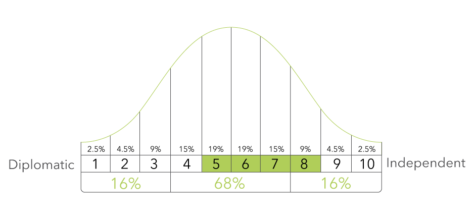
We use a bell curve to showcase the distribution of scores in the form of a graph. The term “bell curve” originates from the fact that the graph looks like a symmetrical bell-shaped curve. In a bell curve, the peak represents the most probable event in the dataset.
In the context of candidate scores, it means that the highest point on the curve, or the top of the bell, represents the most common score candidates achieve. Each section of the bell curve showcases the probability of a candidate receiving each score: 2.5% will score 1, 4.5% will score 2 and so on. The farther away from the peak or middle, the less common the score is.
In the example benchmark for the Diplomatic vs. Independent scale (shown above), approximately 68% of all candidates will fall between a score of 4,5,6, or 7 on the benchmark. Individuals who score 1,2,3,8,9, and 10 are less common and can be considered outside the average.
Bringing in the Prevue Benchmark
The Prevue Benchmark shows the preferred characteristics of an employee for a particular position. These characteristics are displayed as a range of desired sten scores on each scale. A sten score divides a scale into ten units, essentially a 1 to 10 score. This range is shaded and forms the benchmark for the scale. The candidate’s assessment results are shown as circled numbers and compared to the shaded ranges. The Benchmark Suitability Score is derived from a formula analyzing the candidate’s sten scores on the benchmark (circled score is inside the shaded range) versus those scores that are off the benchmark (circled score is outside the shaded range).
This example benchmark for the Diplomatic vs. Independent scale shows the shaded range of stens from 5 to 8. Scores of 5,6,7 or 8 will be on the benchmark. Scores of 1,2,3,4,9 and 10 will be off the benchmark.